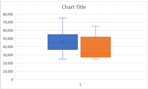
Box and Whisker Chart in Excel
Box plots are usually called box and whisker charts. These are used not only to visually summarize a dataset but also to understand the distribution of the data better. On this page, we will discuss what a box and whisker chart is, how to interpret a chart, and how to create a box plot chart in Microsoft Excel.
What is a Box Plot (Box and Whisker Chart)?
A box plot (box and whisker chart) is a tool to graphically present the distribution of a set of data. It is commonly used in statistical data analysis. Let’s take a look at the example of a Box Plot chart below.

The box plot divides data into four parts or quartiles. The main box of a box plot chart is drawn between the first and third quartile, while the middle line represents the median of the distribution. As such, the width of the box represents the most concentrated area of the data. In addition, The Whiskers in a box plot chart are the lines that show the minimum and maximum values that are typically outside the first and third quartiles.
Why use a Box Plot?
As mentioned above, a box plot is an effective way of visualizing the data in five partition marks whereas each partition mark can be identified very easily. Given the construction of a box plot, it is a helpful way of understanding the overall distribution of the data and spotting the outliers. For a large dataset, a box plot is even more useful to summarize the data.
How to Interpret a Box Plot?
Below is a dataset of employee salaries in a certain company. As the dataset is small, we can read the data to find out who’s salary is what? However, for a large dataset, it’s difficult to even find the minimum or maximum salary or visualize the data all at once.
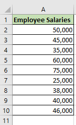
To visualize the distribution of the sample salary dataset in a chart, we can draw the following Box Plot.
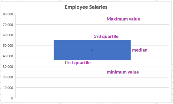
The way we can interpret above chart is:
- The highest salary paid by the company to its employee is $75,000 as indicated by the tip of the top whisker mark or line.
- The lowest salary paid by the company to its employee is $25,000 as indicated by the tip of the bottom whisker mark or line.
- To find the range of the salaries, we need to just take the difference between top and bottom wisker marks (e.g., 75,000-25,000 = 50,000).
- The tip of the top whisker mark also shows how fat it is from the median, which is the line that runs across the middle of the box. This also indicates whether the distribution is skewed or not. Additionally, the position of the box also tells us the magnitude of the outlier observations.
How to Create a Box Plot Chart in Excel?
If you are using Excel 2016 or onwards, you can easily draw a box plot chart with the following dataset. This dataset shows employee salaries for two different companies- Company A and Company B.
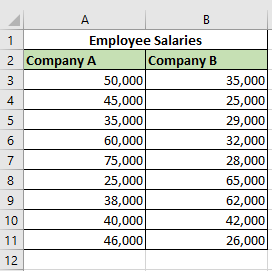
- Select the range of cells containing your dataset. In our example, we can select the range as A2: B11.
- From the Insert tab, click on the icon that shows a bar chart, as shown in the image below.

- The dropdown menu as in the picture below will show you different charting options. We can select the “Box and Whisker” chart.
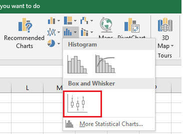
- You should now get a Box Plot chart based on your selected data. The chart will look like the one below.

- The default option in excel draws a Box Plot chart exclusive of median. To convert this chart into inclusive of median, select the series options icon from your format data series sidebar (on your right-hand side) and check the radio button that says “inclusive median.”
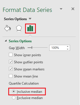
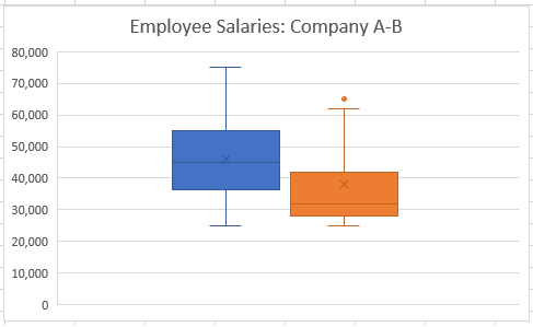
As shown below, you get a beautiful box plot chart drawn from your dataset. You can now change the title of your chart and edit the aesthetics of the chart as you like.
I hope it was helpful for you. You may want to navigate around the website to see other posts that could potentially address your other questions. Thanks!
